Navigation Aids in Simplicity Studio
A list of the icons and other navigational elements in Simplicity Studio and how they are used is in the table below.
Icon or Navigational Element | Description |
|---|---|
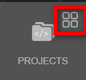
| When you hover over the Projects, Devices, Tools, or Settings button in the vertical navigation bar of Simplicity Studio, a little grid icon displays in the upper right corner. Click this icon to return to the Home page. |
| Click to expand all items in a list. |
| Click to collapse all items in a list. |
| Click to expand all items in a selected list. |
| Click to collapse all items in a selected list. |
| Filters items in a list. |
| Search icon, located at the right of a field where you can enter a search term to find information in a list or on a page. After entering your search term, click this icon or press Enter to view the results. |
| Click to expand a menu with more options to complete a task. |
| Click to refresh a page. |
| Click to add or select an item, such as a device or SDK. |
| Click to remove an item. |
| Click to delete an item. |
| Click to either open a Settings page or expand a list of settings. |
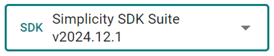
| An example of a dropdown list. Click the down arrow on the right to expand the list. |
| An activated toggle, which turns on a feature or option. Click the toggle again to turn it off, as shown in the row below. |
| An inactive toggle where a feature or option is turned off. Click the toggle again to turn it on, as shown in the row above. |
| Click to add an SDK extension. |
| Click to run a device or operation. |
| Click to start a managed run. |
| Click to test a device. |
| Click to display a tooltip with more information about a feature or option. |
| Click to display a menu showing the history of package installations, updates, and packages you uninstalled. |
| Click to close a page or window or cancel an action. |

